



How To Graph Oscilloscope Data Log In Excel
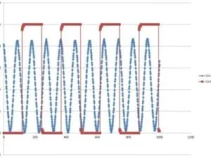
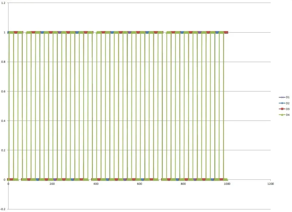
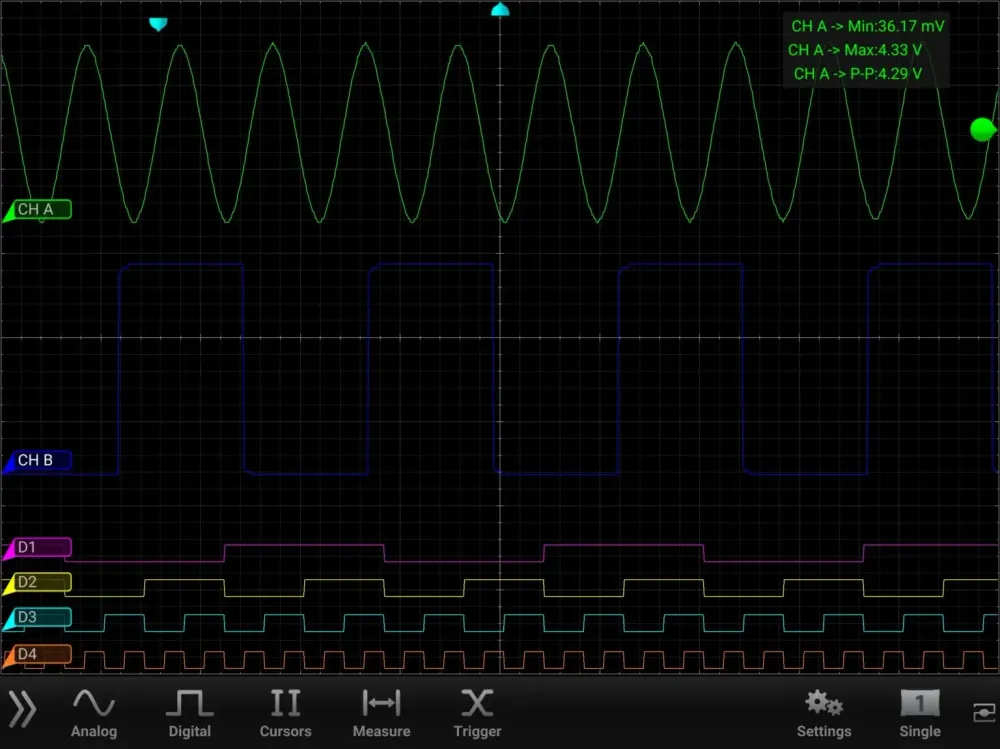
If you’ve ever wanted to recreate your oscilloscope screen, it’s possible in Excel. This example regraphs both analog and digital waveforms. And this is how to do it:
Step #1
First, log data. Then, email that data to a device that has Excel. The data log will be in *.csv file format.
Step #2
Here’s the excel file that was used to graph the waveforms. Please use it as a reference. The analog is a bit easier than the digital. The digital waveforms require Rows 4-8. Because, Excel isn’t smart enough to translate hexadecimals and you are.
Graph_Oscilloscope_CSV_DataLog_20171012.xlsx
Step #3
Enter your email to subscribe to our newsletter and receive updates.

At Oscium, we've spent over 16 years turning complex technology into tools that
work better for everyone.


©2026 OSCIUM. All Rights Reserved.